Color plays a critical role in interior design, impacting not only the aesthetics of a space but also the mood and emotions of those who inhabit it. Understanding color psychology in interior design can help you select the right tones to create the atmosphere you desire, whether it’s calming, energizing, or inspiring. In this article, we will dive into the interior design color psychology behind different colors and how they can be applied to various spaces in your home.
Colors in interior design psychology have a profound effect on human emotions. While some colors can evoke calmness and tranquility, others can stimulate energy and creativity. The key to using color for interior designeffectively lies in understanding these emotional triggers.
Red is a bold and energizing color that can bring warmth and intensity to a room. It is often used in spaces where activity and excitement are encouraged, such as living rooms, kitchens, and dining areas. However, because of its stimulating effect, it should be used sparingly, as too much red can lead to feelings of aggression or anxiety.
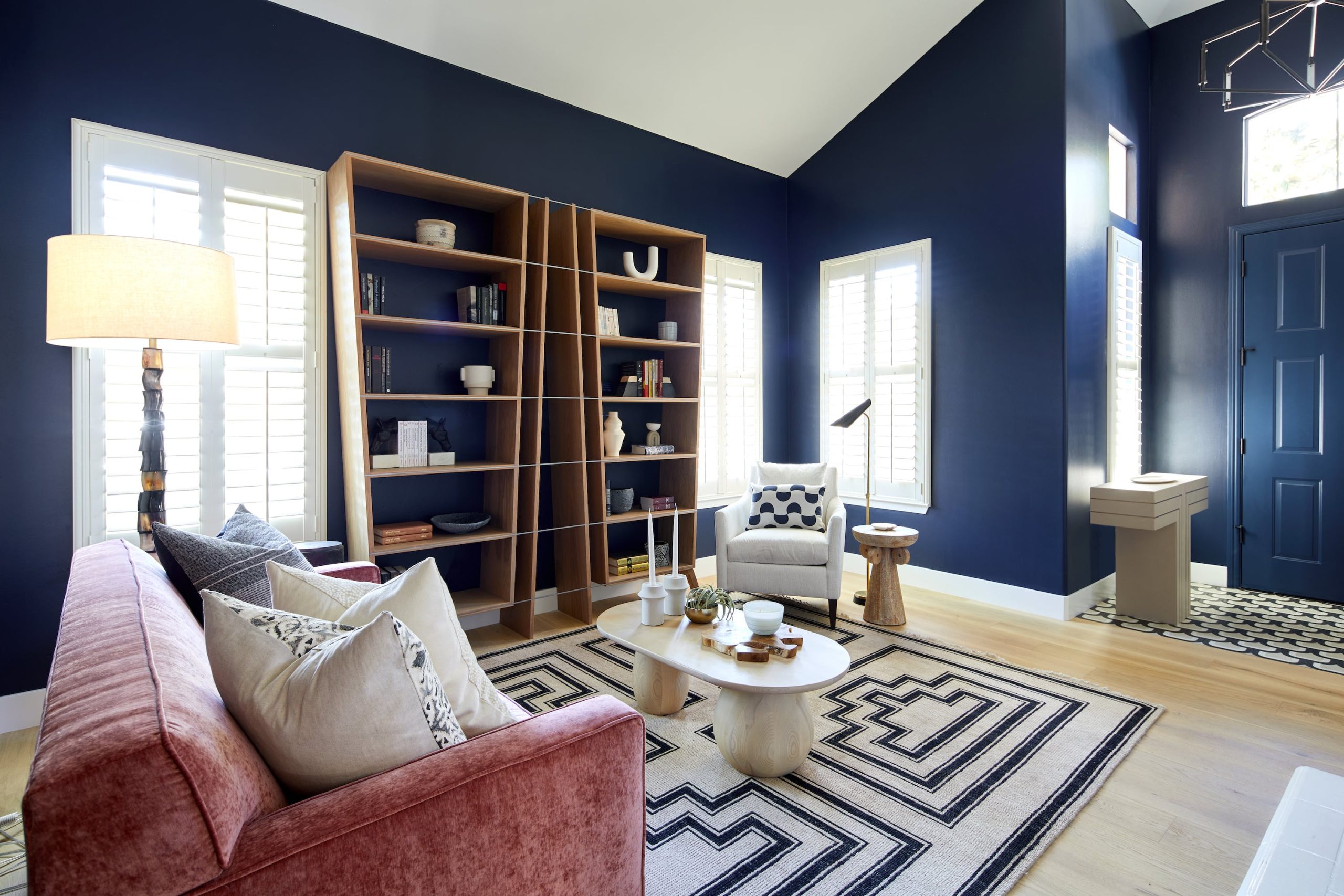
Blue is widely regarded as one of the most calming and soothing colors, often used in bedrooms and bathrooms to create a serene atmosphere. It can also promote productivity and focus, which is why it’s often chosen for offices or study spaces. Additionally, blue is associated with trust, making it a popular choice in spaces where professionalism and reliability are important.
Yellow is the color of sunshine, evoking feelings of warmth, happiness, and optimism. It is a great choice for kitchens, entryways, or spaces where social interaction takes place, as it promotes energy and conversation. However, in excess, yellow can be overwhelming, so it’s best used in accents or as a secondary color.
Green, with its connection to nature, promotes balance, calm, and renewal. It is an ideal choice for living rooms, bedrooms, and offices, as it can help create a peaceful, grounded environment. It also promotes creativity and focus, making it perfect for areas where mental clarity is needed.
Orange is a lively and energetic color, perfect for spaces that encourage creativity and social interaction. It’s often used in home offices, kitchens, or playrooms to stimulate conversation and mental energy. Like red, it should be used in moderation as it can become overwhelming in large doses.
When choosing interior design color, one of the first decisions is whether to use warm or cool colors. Both can be used effectively to create distinct moods, but understanding their differences will help you make the right choice for your space.
Warm colors, such as reds, oranges, yellows, and browns, tend to create an intimate, cozy atmosphere. These colors are often used in areas where people gather, such as living rooms and dining rooms, as they encourage socialization and create a welcoming environment. They can make a space feel warmer, especially in cooler climates.
Cool colors, like blues, greens, and purples, have a calming and tranquil effect. They are typically used in bedrooms and bathrooms to promote relaxation and rest. Cool colors can also make a space feel larger and more open, making them ideal for small rooms or areas with limited natural light.
The lighting in a room can dramatically change how a color appears. Natural light, artificial light, and the type of light bulbs used all affect the interior design color in a space. For example, a cool-toned room can appear warmer when bathed in soft, warm light. On the other hand, fluorescent lighting can cause certain colors, like yellow or red, to appear harsh and overly bright.
When selecting colors, it’s important to consider the amount of natural light a room receives. Rooms with limited natural light benefit from cooler colors, which reflect light and help brighten the space. Conversely, well-lit rooms can handle richer, deeper tones without feeling too dark or enclosed.
Different areas of your home can benefit from distinct color schemes, depending on their purpose. Understanding how to use colors in interior design psychology in different spaces will allow you to create a harmonious and functional home environment.
The living room is often the heart of the home, where friends and family gather. To create a space that promotes warmth and connection, choose colors like soft reds, yellows, and oranges. For a more tranquil and soothing environment, use blues and greens. Neutral tones like beige, grey, or taupe also work well as base colors, allowing you to add pops of brighter shades through accents like cushions and artwork.
Your bedroom is a place of rest and relaxation, and the color you choose can help foster this atmosphere. Soft blues, greens, and muted purples are ideal for promoting sleep and tranquility. Avoid overly bright or bold colors, as they can cause restlessness or disrupt sleep patterns.
The kitchen is a space that often requires both functionality and a sense of energy. Warm colors such as reds, oranges, and yellows can stimulate appetite and make the space feel welcoming. If you want a more modern feel, opt for a neutral palette with accents of bold colors, or incorporate greens and blues for a calming yet inviting effect.
When designing a home office, choose colors that promote focus, creativity, and productivity. Soft greens, blues, and grays are ideal for creating a peaceful, balanced environment. You can also use accents of yellow or orange to stimulate mental energy without overwhelming the space.
Incorporating multiple colors into your interior design color scheme can create depth and visual interest. However, it’s important to strike the right balance. Too many contrasting colors can create chaos, while too few can make a space feel dull.
A harmonious color scheme often uses complementary or analogous colors. Complementary colors are opposite each other on the color wheel (e.g., blue and orange), while analogous colors sit next to each other (e.g., blue, green, and turquoise). Mixing these colors thoughtfully can help create a balanced and aesthetically pleasing space.
Color psychology in interior design is more than just selecting your favourite hues. Understanding the emotional and psychological effects that colors have on our well-being can help you create spaces that are both functional and reflective of the atmosphere you want to create. From calming blues to energizing oranges, every color for interior design carries its own significance and can be used to enhance the mood of your home.
By using these insights into colors in interior design psychology, you can ensure that your home’s interior is not only visually appealing but also conducive to your lifestyle and emotional needs.
RECENT COMMENTS